This project is a side project that I have been working on myself. I own a Subaru WRX myself and I felt that the app need some adjustments to fit the Subaru WRX/STI enthusiasts aesthetic. Subaru does have an app called MySubaru, which essentially gives you the ability to unlock/lock, remote start, adjust climate, etc. When I browsed this app, I thought that it could definitely use some upgrades to improve user experience. Ultimately, my goal was to take the Subaru app and design it for the WRX/STI owner market only.
Why Subaru?
Ever since I was a kid, Subarus have been one of my favorite cars. Ever since playing rally video games, I have always had a love for the Subaru WRX/STi. My brother and I would also go to the Subaru meets around the North East to meet others who have the same passion. I also have a WRX myself. All of these fueled my desire to create an app tailored specifically to the Subaru WRX/STI Enthusiasts.
Challenges
My goal for this app was to design this for the WRX/STI car enthusiasts. This market that Subaru has for their sport division and the following for the brand is massive due to its rally routes. Because of this, the app needed to have a sporty feel. By making it sporty, I planned to use red, blacks and whites which resembles the colors of the lights in the car.
The app needed to be easy to use on the go and simple. When I think of the car enthusiast community, I think of these users being people who want something that looks good yet functional. It doesn’t need every bell and whistle but things that make a process simple goes a long way. Including a part to control their climate inside the car is absolutely necessary.
Another challenge was that I felt that this app needed a dark mode. When thinking of my end user, I think of users at night trying to use the app. Pulling an app out in the dark with a white background is very strenuous on the eyes.
Since this app would be competing against others such as Tesla, I definitely wanted this to stand out.
Design Process
When starting this process, my thought was that Subaru’s app was very minor and put together simply for ease. Since I wanted to design this app towards the enthusiast audience, I wanted to make sure I got the styling and color palette just right.
To begin, I started with an image of the car, which samples from the Tesla car app. In my mind, the car color would change based upon the real car color. Subaru has photos of these models on their website so it would cost them no extra money to use those car samples.
As I was designing the wireframes, I kept in mind the simplicity of the app on the go. Users of this app may start their car from their house but when unlocking a car, most people may have their hands full. This is why on the key fob screen, I made sure the the buttons were large enough for something to select quickly on the go.
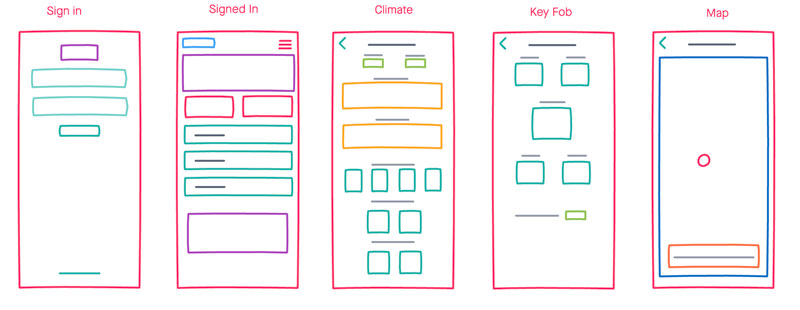
Wireframes
App Home Screen
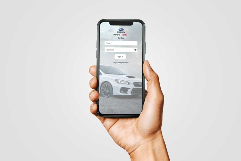
The app home screen that I designed is pretty simple and to the point. The user would normally be registered by the dealer to the account, therefore, I did not see the need to put a registration flow. For this screen, I felt that it was necessary to give them a nice wallpaper image of the car with the logos at the top. This would allow for the keyboard to come up and not cover any input field.
Colors and Layout
From the start, the idea was to make this app simplistic to the user for quick use, and styled towards the target audience. At my first pass at this, I went with the Subaru blue that I got from their color palette. From here, I started to design the layout. As time went on, I started to realize that the blue was not providing the sporty feel that I wanted to accomplish. With this in mind, I sampled from the STI red and used that as an accent color instead.
As I was figuring out the colors, I was also trying to figure out the best way to create the layout. As I worked with the styles of buttons for a bit, I decided to go with a very light grey for the background of the whole app and then use white for the button background with an accent colored symbol and arrow.
The climate screen was where it got a lot more fun. I enjoyed trying to find ways to make this very user friendly. I had the idea to put the same white backgrounds behind each climate setting.
For the key fob screen, I was looking for a simplistic look that the user could easily click on the go. Especially if the user is trying to use the function in a hurry.
The location screen would be pulling a map from Apple or Google simply showing the location of the car and if it is moving or parked. The screen would change based upon the activity of the car
Operation Dark Mode
For this app, I really wanted to create a dark mode version. I feel that dark mode is very important for applications. Especially an app like this which is definitely going to be used in a night setting. I’ve done research on the ways to create a dark mode color scheme based upon the day version application.
With this in mind, I took the STI red and made it less vibrant by toning it down and making it a bit lighter. As you can see, it really helps your eyes to not strain or be blinded once the app opens. I felt that this design was also necessary seeing that dark mode is a great thing to improve user experience when viewing at night.
App Tile Design
I wanted to do my best to create the full user experience from home screen to starting the app. My tile design had to versions, one was based off of using my accent red color with the WRX and STI logo being white. While the other version is a dark grey with the same white logos.
Conclusion
This is definitely not a set in stone design yet. I still have some design work to do, but I feel that this was a great first pass at the app. I plan to extend the functionality to include a maintenance section and even create an apple watch app as well. There are many other features that I would like to include. That will be part of a whole new case study to further improve upon the user experience and functionaliy.