What is Chewsi? Chewsi is a new wave of dental care that reflects GoodRX in a way. The whole goal of Chewsi is for users to get instant access to savings and dental care. These are savings for people who either have no dental insurance or people who have run out of procedures that their insurance allows.
With Chewsi, a user can use their website or app to “Find a Dentist” which gives you all the Chewsi dentists in the area you select. The journey of the user is that they find a dentist that supports Chewsi, go to that dentist for their procedure and save. At this time, a new user can only register on the Chewsi app. The business had decided that they would like to put an ability for new users/members to register on the Chewsi website and update the look of the application registration flow.
Challenges
One of major challenges of this project was to create a new web registration flow for those users/new members who would prefer not to download the application. We were seeing 60% of our users going to our website first before downloading the Chewsi app. To make the process of signing up for Chewsi much better user experience, implementing a registration flow on the website was needed. In addition to the website design, the Chewsi app needed updating as well to match with the new updated look for the website. Which includes some different uses of the branding colors.
Also, during the registration process it was a goal to make clear that a credit card was not needed at time of registration. Our research showed us that a good amount of our audience was dropping off at the credit card entry screen because once those fields popped up, they though it was required.
Design Process
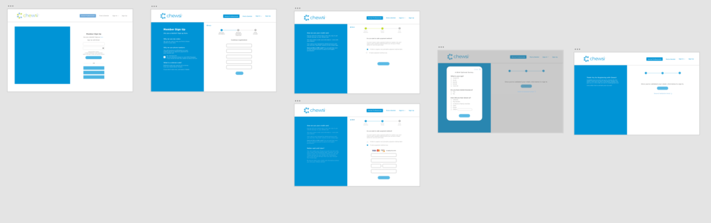
To start off this project, I made sure to draw out all my ideas and come up with wireframes that would consist of a general idea. The wireframes that I created changed as time went on heavily.
When I first started off, we had the idea to put information on the sides of the page to give transparency to the user/new member. These info boxes contain background as to why we are asking for specific pieces of information. I thought that this was a great idea seeing the way the world is today. It’s good for people to know exactly why we need their info and how it will be used to help them.
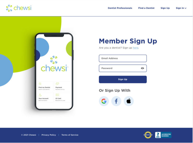
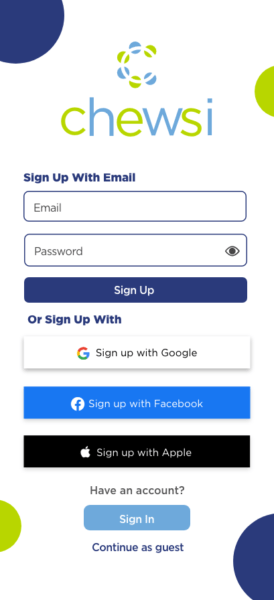
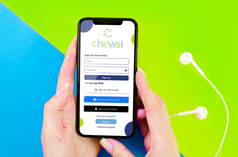
Web Registration Design
As you can see above, we wanted the registration process to be clear and concise to the users. Especially seeing that these users are of the older demographic. Due to this, we really wanted to make sure that every step of the user registration flow was featured with information on the side. I felt that this was a great way to walk the user through and answer any questions that they might have during the process.
To cut any confusion for the credit card screen, I included two options for the user using radio buttons. The user can select to provide no credit card or put one in. When a user comes to the screen, the default option will be not to select a card. Then once they select to add a card, then the fields pop out. This way, users will not get afraid seeing those credit card fields and they know that they can move on without putting one in.
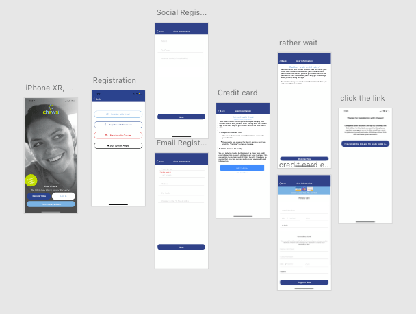
Mobile App Registration Redesign (IOS & Android)
In addition to the website getting a new member registration flow, the app needed to be updated to match the web and improve user friendliness. These redesigns were made because the registration flow could definitely have used an updated look and the social media buttons were changed to be more inline with guidelines.
Before
After
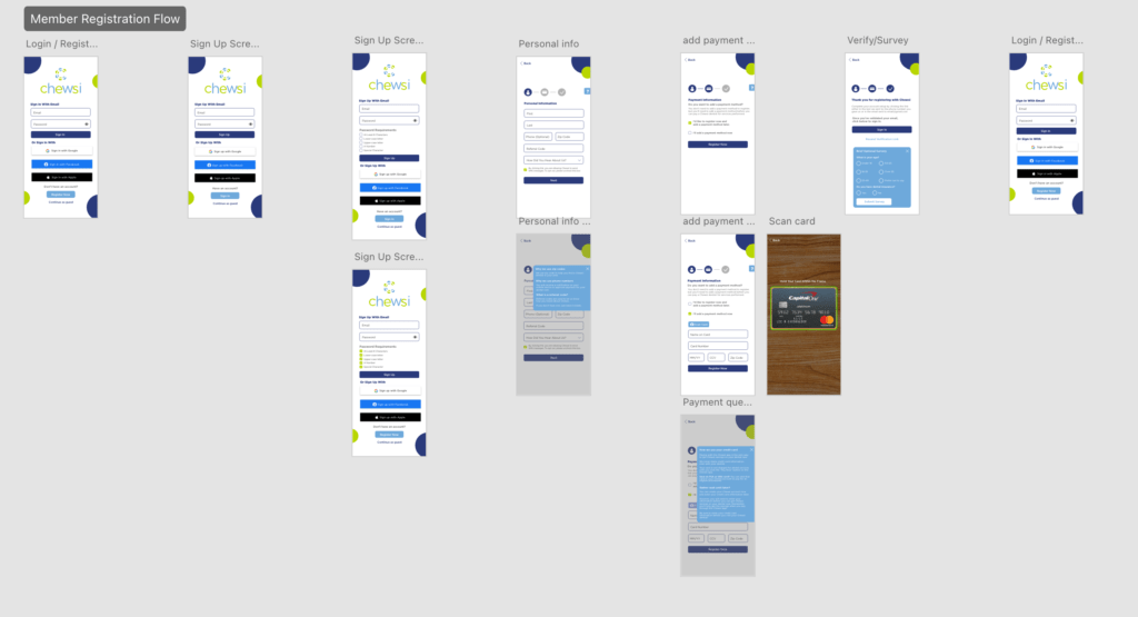
While designing these wireframes, the user persona’s of the possible new members was circling in my head. One thing that I thought was huge to bring over from the web registration was the information box. This module shows why we need personal information and what we do with it.
While designing the app’s registration flow, I wanted to make sure it was fully usable for a wide range of audience. With that being said, I made sure that my buttons were easily clickable and text boxes were spaced out in a respectable manner. Especially seeing that if boxes are too close, someone is more likely to fat finger it.
As you can see from above, I took the registration user flow that was already in place and transformed it into a more modern look to improve user experience. In my design, when a user hits the input field for email, the fields slide up to make room for the keyboard so that it doesn’t cover any fields or buttons.
You can also see that the text is cleaned up with the buttons to continue right below it. In the before screens, I found that the button to hit next or continue was placed in different places with a lack of continuity.
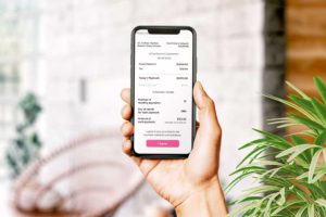
I designed the credit card screen a lot more simple. With the way it was created before, I felt that it might cause confusion to the user. At first glance, the user might think they have to put in two credit cards instead of one. To fix this, I made it so that there is a plus button to add a second card if need be. To go with this, I also added a feature for scanning a credit card in. I felt that this feature is a great way to boost user experience.
New vs Old Up Close
Conclusion
To conclude this case study, I felt that this redesign and website addition went very well. This new use of branding and mobile design strategy shows. The goal is to always make a user friendly app but thinking of the little things helps me to push my designs further. The end user is the most important and what they see through their first impressions matters a lot to a business no matter how big or small.
I feel that we successfully took the app design to a new level. It’s not as busy because we got rid of the image. We put everything up front to the user while using brand shapes and colors. This new design of the app speaks so much more towards the brand and what Chewsi represents.