What is Chewsi? Chewsi is a new wave of dental care that reflects GoodRX in a way. The whole goal of Chewsi is for users to get instant access to savings and dental care. These are savings for people who either have no dental insurance or people who have run out of procedures that their insurance allows.
With Chewsi, a user can use their website or app to “Find a Dentist” which gives you all the Chewsi dentists in the area you select. The journey of the user is that they find a dentist that supports Chewsi, go to that dentist for their procedure and save. At this time, the application is the only way to register and pay for your dental visit. Updates to include payments on the website is coming soon.
Challenge
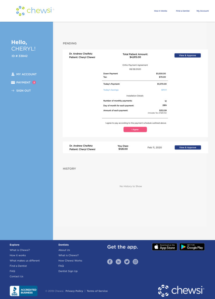
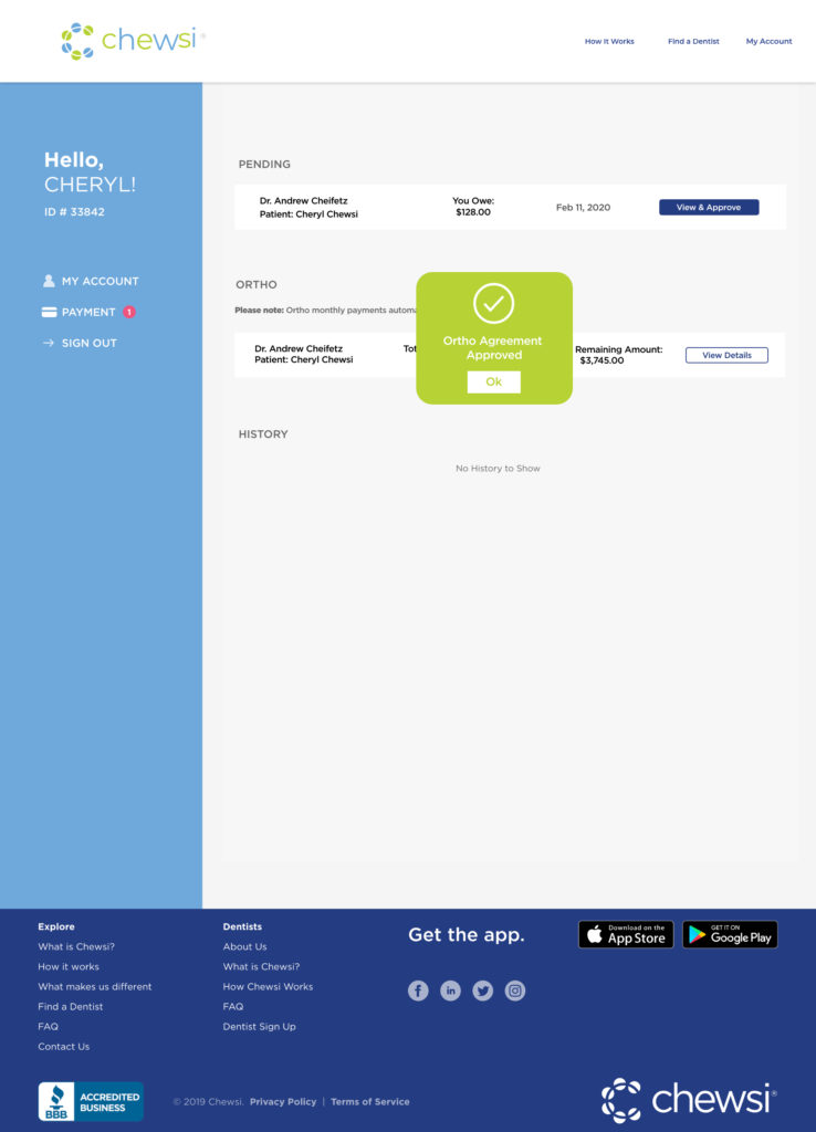
On the Chewsi website now, the only thing that users/members can see is general account information and payment history. The Chewsi app currently holds the only ability for users to make payments and approve transactions.
The challenge of this project was to allow users to make and approve payments through the web portal. This is needed because after doing user research, we found that members our website visits was a lot more than the application. In addition to including these new web features, I also was tasked with using updated branding colors.
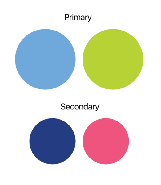
Branding Colors
User Research
target audience is aimed towards older generations who have children who have had orthodontic procedures done. With this in mind, I wanted the information architecture to be easy and simple to understand for the end user (Older Demographic). The other goals of this project was to create a simple and easy to use mobile web interface and include the updated Chewsi branding color scheme.
To point out actions that we want the user to take, we put it in the Chewsi magenta color. I experimented with using the Chewsi green but with the text size and color, it was not accessible for everyone to use.
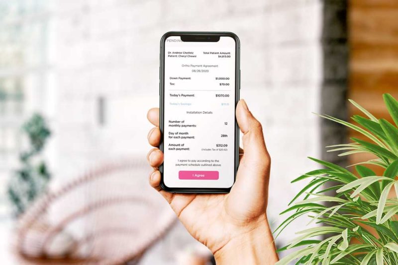
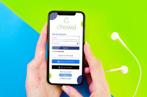
The goal was to make sure that this piece looked good on mobile since these users would most likely be logging on from the dentist office/reception desk. Due to this thinking, I designed mobile first knowing that information. This also allowed me to understand how this could translate into the app for the future.
Design Process
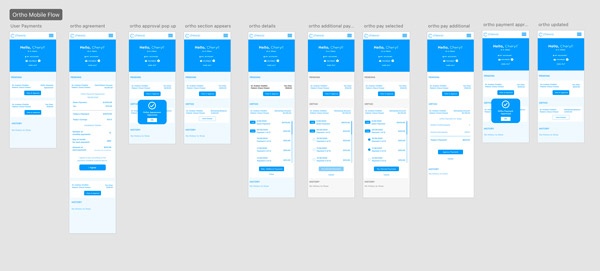
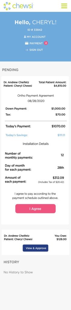
In my design process, I started wireframing and prototyping the mobile design first. During this process, I was thinking about responsiveness and the ability to be seen across many devices. The challenge was to include all of the information needed in a way that didn’t overwhelm the user. Taking this into account, I used a design where the price was inline with what procedures were performed. Also in an orthodontic sense, we wanted to show their down payment and all the other necessary information.
Mobile Web Design
Ortho Mobile Designs
Regular Charge Mobile Design
Desktop Web Design
Although we found mobile is tailored most towards the user, I definitely wanted desktop to have the same look and feel.
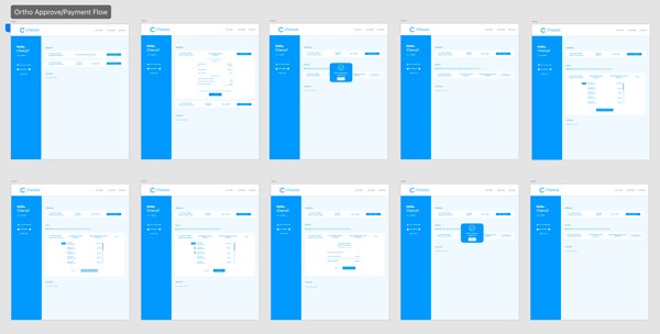
User Flow
As I was designing the additional screens for the different payment flows, I kept looking at this from the user’s persona. I’m always thinking of the end user to ensure that my designs are optimized for the target audience. From how I look at it, if you don’t design like you care about the user, why do they care to use your application or business?
Reflection
To conclude this case study, I think that the mobile design of this project was very strong and I tailor that towards design for mobile first. With most of our users coming using their phone at the receptionist at the office, it made so much sense to focus on that experience first. I strongly believe that designing for mobile first is an absolute must. Unless your businesses has multiple long forms or a heavily desktop use audience.
The new colors that have been injected into the brand/website give this user flow a great look. I feel that the colors give the site a very welcoming and secure feeling. The message behind Chewsi is represented well through the use of these colors.
I felt that this new implementation for the Chewsi Payment/Approval flows was very successful. This new addition to the Chewsi Member portal is very user friendly for all audiences. Especially the older generations which was our target audience for this project.